Planning a getaway should feel like a breezy walk on the beach, not a trek through a jungle of confusing interfaces, hidden fees, and mobile meltdowns. Yet, many travel websites are turning dream vacations into digital disasters.
In this deep dive, we uncover the top user experience (UX) mistakes travel websites make that leave users frustrated, clicking away, and saying, “No thanks, I’ll book elsewhere.” Plus, we pack in solutions so smooth, they’ll make your bounce rates drop faster than a flight deal alert.
1. Performance Problems: Slow Sites Sink Sales ⏳
Let’s be honest: Nobody has the patience for a slow-loading travel site. With 70.5% of traffic coming from mobile in 2024, speed is everything. A 0.1s improvement in load time can boost conversions by 10.1% NitroPack. But 40% of users will bounce if your site takes more than 3 seconds to load SITE123.
Mobile Misery: Despite the traffic, mobile has the worst conversion rates. Why? 85.6% of users abandon mobile bookings due to poor load times and clunky design HotelChamp.
Fix It Fast:
- Compress and lazy-load images
- Use next-gen formats like WebP
- Prioritize above-the-fold content
- Test with Google PageSpeed Insights
2. Navigation Nightmares: Where Am I Going Again? 🔍
Ever tried to book a hotel but felt like you needed a compass? You’re not alone. 45% of users say bad navigation is their biggest pain point BoostBrands.
The Paradox of Choice: Too many options + poor filters = decision paralysis. Instead of making booking easier, it becomes an overwhelming maze.
Map It Out:
- Use sticky headers and logical categories
- Group services like flights, stays, and packages
- Incorporate smart filters & sorting tools
- Test with card sorting and tree testing methods
3. Booking Breakdown: Abandonment Alley Ahead 🏚
A complicated booking flow is the quickest way to lose customers. 29% of users drop off during a clunky checkout Tab Travel.
Form Fails Include:
- Multi-step processes
- Bad date pickers
- Manual data input
- Confusing error messages
Streamline the Scene:
- Single-page checkouts
- Autofill and smart suggestions
- Just-in-time validation
- Clear error indicators and guidance
One brand increased bookings by 35% just by redesigning their 5-step checkout into one simple page Sennalabs.
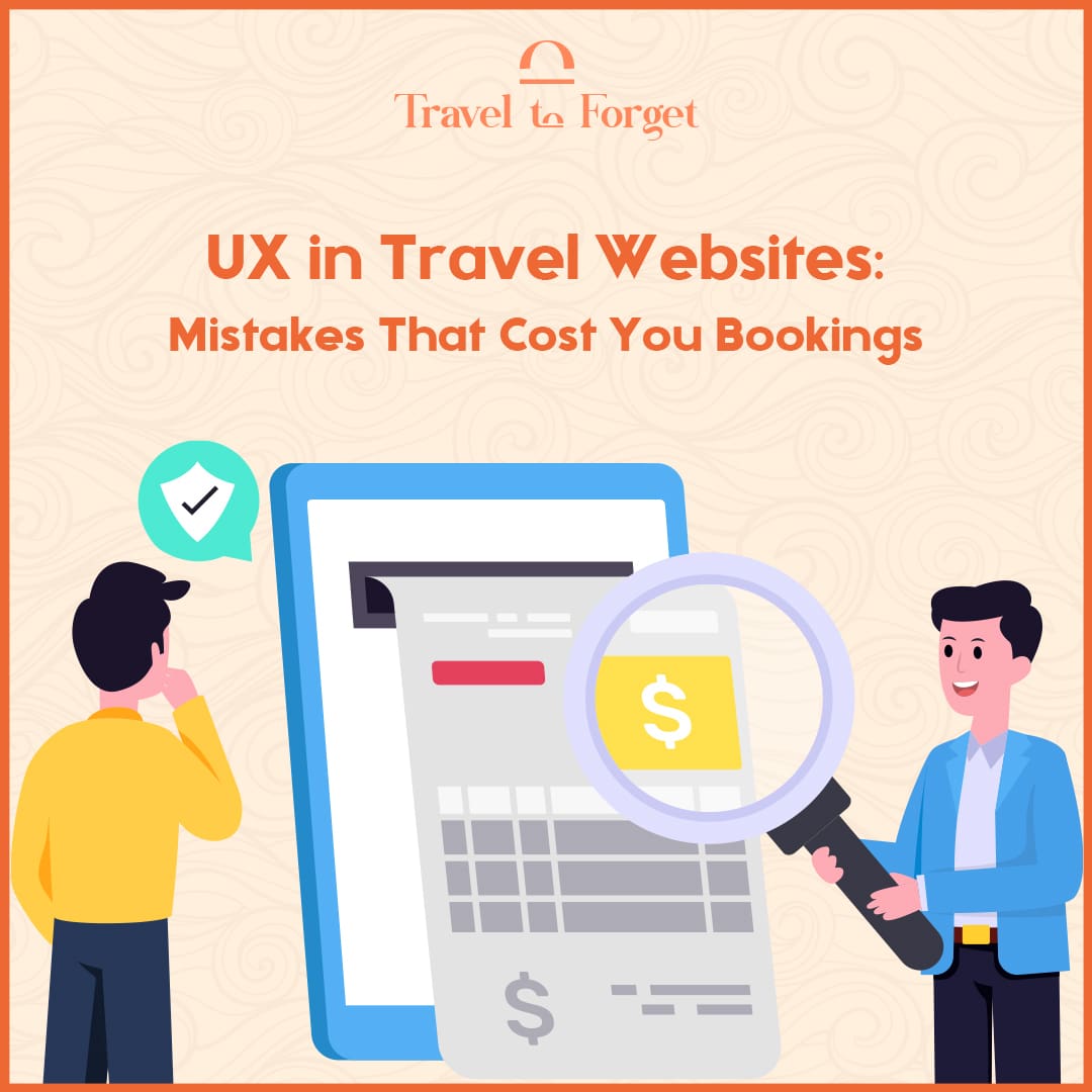
4. Transparency Trouble: The Trust is Broken 🔒
Sneaky charges and vague cancellation policies don’t just cost bookings—they cost reputations. 39% of users cite unclear pricing as their top frustration Glassbox.
Sticker Shock is Real:
- Resort fees? Surprise charges?
- Hidden taxes at checkout?
- Last-minute price jumps?
Build Booking Confidence:
- Show final price upfront
- Outline ALL fees and policies clearly
- Add trust signals: reviews, secure payment icons
Real Talk: 79% of people trust online reviews as much as recommendations from friends MyShyft.
5. Accessibility Apathy: Leaving Guests Locked Out ❌
One in six people lives with a disability. Yet travel sites average 297 accessibility issues per page AudioEye.
Common Culprits:
- Missing alt text
- Poor contrast ratios
- Inaccessible forms & buttons
- Broken keyboard navigation
Design for All:
- Follow WCAG guidelines
- Use high-contrast colors
- Add descriptive alt text
- Ensure full keyboard functionality
Inclusive design is good business. The UK’s “purple pound” alone exceeds £50 billion Yahoo News.
6. Data Drought: No Research, No Results ⚖️
UX isn’t guesswork. Without data, you’re just another travel site throwing spaghetti at the wall. Continuous research is your golden ticket.
Metrics That Matter:
- Conversion rate
- Abandonment rate
- Mobile vs. desktop sales
- Bounce & exit rates
- Accessibility score
Tools That Talk:
- Google Analytics
- Hotjar / Mouseflow
- A/B testing
- Think Aloud Protocol
Pro Tip: Run heatmaps on booking pages to see where users get stuck. Then fix it. Fast.
7. Personalization Pitfalls: One Size Doesn’t Fit All 🔎
88% of travelers expect personalized experiences TravelGenix. If you’re not showing tailored suggestions, dynamic pricing alerts, or recent searches—you’re behind.
Let AI Be Your Concierge:
- Show recently viewed items
- Recommend “Best for You” packages
- Offer chatbot or live chat for last-minute hesitations
The digital nomad wants answers now. Omnichannel support wins over phone-only contact forms any day.
Wrap-Up: Design Travel That Converts ✅
Poor UX is the pothole in the path to profit. But the fix? Totally doable.
Your Travel UX Toolkit:
- Speedy performance = more bookings
- Smart navigation = less bounce
- Frictionless forms = higher conversion
- Transparent pricing = trust
- Inclusive design = wider market
- Ongoing testing = continuous growth
- Personalization + support = loyalty for life
So, the next time you’re designing a travel website, ask: Am I making it easier for my users to book, or harder for them to stay?
Because every tap, scroll, and click is a chance to convert a curious traveler into a loyal customer.
Need help optimizing your travel website’s UX? Let Travel to Forget help you build a smoother, smarter booking journey. Reach out and let’s make your bookings soar like never before 🚀
